
What is the difference between warm white and cool white paint?
Wondering why one white wall looks soft and inviting while another looks blue, sharp, or gray? The answer comes down to undertone and light. Warm white paint contains small amounts of yellow, red, beige, or brown. Cool white paint leans toward blue, green, or violet.
Warm white creates a softer visual temperature
Warm white works best when a room has wood floors, brass hardware, cream fabrics, beige stone, or warm natural light. It reduces the contrast between white walls and those finishes, so the room feels connected rather than patched together. It also makes north-facing rooms feel less icy, although a very yellow warm white can look dated beside bright white trim.
Cool white gives cleaner contrast
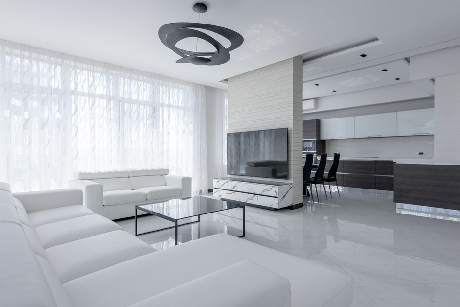
Cool white suits rooms with gray tile, chrome fixtures, blue furniture, black accents, or strong afternoon sunlight. It can make cabinetry and trim look crisp. The risk is a blue cast in a room with weak daylight. A cool white with a blue-green undertone can also make pale skin tones and warm wood look dull.
| Paint type | Common undertone | Best light | Best design partners |
|---|---|---|---|
| Warm white | Yellow, beige, red, or brown | North-facing or low light | Oak, walnut, brass, cream, terracotta |
| Cool white | Blue, green, or violet | South-facing or bright light | Gray, marble, chrome, navy, black |
| Neutral white | Very small undertone | Mixed or changing light | Modern and traditional finishes |
Light Reflectance Value, or LRV, matters too. A higher LRV reflects more light and makes a room appear brighter. Undertone tells you how the white feels; LRV tells you how much light it throws back.
My quick verdict: choose warm white for comfort and cool white for contrast
Pick warm white when the room should feel relaxed
Warm white is the better default for living rooms, bedrooms, dining rooms, and older homes. It handles wood, woven textures, warm metals, and soft lamps with less visual conflict, and it hides the cold blue cast that often appears when a room receives little direct sun; choose a restrained warm white rather than a creamy yellow if you want a clean finish that still feels comfortable.
Pick cool white when the room should feel crisp
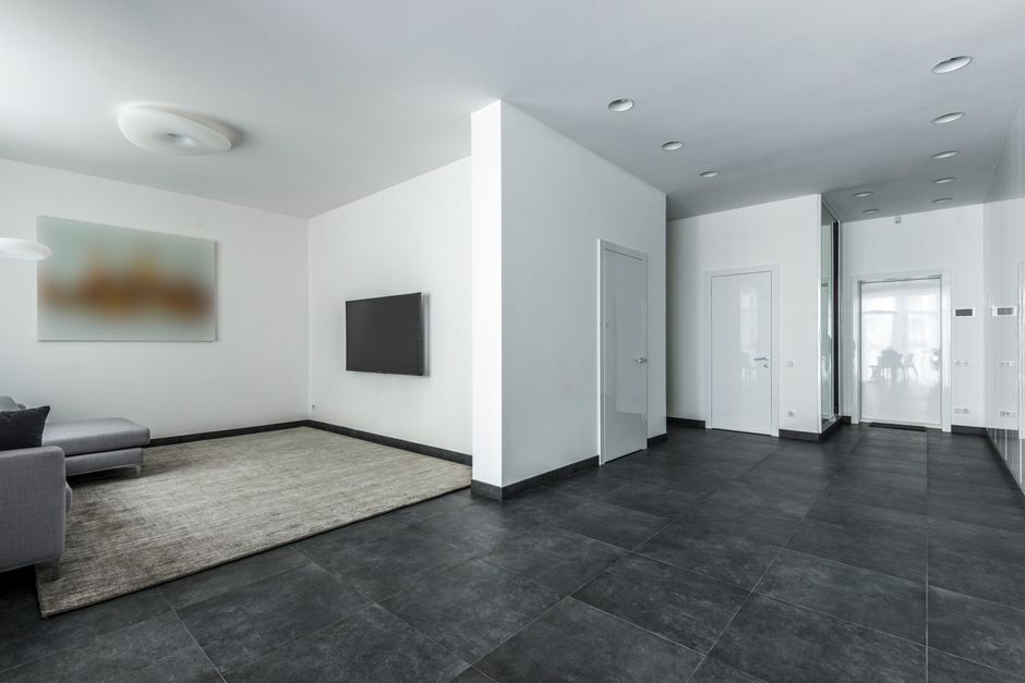
Cool white wins in bathrooms, utility rooms, contemporary kitchens, and spaces with gray or blue finishes. It makes polished surfaces look cleaner and creates stronger contrast around black window frames, white subway tile, and stainless steel, but it needs enough daylight or balanced LED lighting to avoid looking flat and blue after sunset.
If you want one whole-home white, use a soft neutral or barely warm white rather than a strong cool white. That choice gives you more freedom with furniture and reduces the chance that one shaded hallway will look noticeably gray.
How to choose a white paint by room, light, and existing finishes
The best white is the one that corrects the room’s biggest visual problem. Do not start with a paint card and hope it works everywhere. Start with the window direction, permanent finishes, and the bulbs you use after dark.
Living rooms and bedrooms need a low-glare warm white
For a living room with oak flooring, tan upholstery, or a brick fireplace, Benjamin Moore Regal Select Simply White OC-117 is a strong choice. Its LRV is about 91.7, so it keeps the room bright while its slight warmth stops the walls from feeling sterile. For a quieter bedroom with darker floors, Benjamin Moore White Dove OC-17 is better. Its LRV is about 85.4, and its gray-beige balance gives the walls more depth without turning them beige.
Use these colors on walls, then test the trim separately. A bright trim white can make a warm wall appear more yellow. Matching wall and trim in different sheens often looks calmer.
Kitchens and bathrooms need undertone control
In a kitchen with gray quartz, blue-gray cabinets, or stainless steel, Sherwin-Williams Pure White SW 7005 is a dependable cool-leaning neutral with an LRV around 84. It stays clean beside metal without becoming as icy as a stark blue white. In a bathroom with warm limestone, oak, or brushed brass, Sherwin-Williams Alabaster SW 7008 is the stronger pick. Its LRV is about 82, and its gentle warmth keeps stone and wood from looking disconnected.
For a creamy traditional kitchen, Behr Swiss Coffee 12 is another useful option, with an LRV in the mid-80s and a noticeably warmer appearance. It is not the right choice beside bright blue-white tile. The verdict is simple: use Pure White with cool finishes, Alabaster or Swiss Coffee with warm finishes, and never ignore the color of the countertop.
Hallways and open plans need one controlled transition
Open-plan homes expose undertones quickly because one wall can face north while another catches direct sun. Choose the room that is hardest to correct, then select a white that survives its worst light. A soft neutral usually beats a strongly warm or cool shade. Paint a large sample on two walls and view it at 8 a.m., noon, and under evening bulbs before committing.
Five paint mistakes that make white walls look wrong
White paint fails for predictable reasons. Fix these before blaming the color.
- Choosing from a tiny paper chip. A two-inch card hides undertones and gives no clue how the color will react to your floor, ceiling, or furniture. Paint a sample at least 24 by 24 inches.
- Testing on only one wall. A north-facing wall may look gray while a sunlit wall looks cream. Test the same color beside a window and in the room’s darkest corner.
- Ignoring the ceiling. A stark ceiling can make warm walls look yellow. A soft white ceiling often creates a smoother transition.
- Matching the color but not the sheen. Eggshell walls beside glossy trim create a stronger contrast than many people expect. Use satin for high-moisture areas and keep the difference intentional.
- Forgetting artificial light. A 2700K bulb adds warmth; a 4000K bulb adds a cooler, sharper cast. Check the paint after sunset with the bulbs you actually use.
- Using one white in every lighting condition. The same color can look calm in a sunny kitchen and dirty in a dim hallway. An open-plan home can still use two related whites if the transition occurs at a doorway or architectural break.
The safest test method is to move a painted board around the room instead of judging a sample fixed to one wall. If the color looks acceptable in the worst corner, it will usually look better in the rest of the room.
White paint questions homeowners ask before buying

Is warm white or cool white better for a small room?
Warm white is usually the better pick for a small room with limited daylight because it prevents the space from feeling blue and empty. Choose a high-LRV warm or neutral white so the walls still reflect light. A dark floor, warm wood vanity, or beige sofa supports this choice. If the small room has bright southern light and cool gray finishes, a soft cool white can work, but avoid a strong blue undertone.
Can warm white and cool white be used in the same house?
Yes, but connect them with a clear design reason. Use warm white in bedrooms and living spaces with wood, then use a cleaner neutral white in a bathroom with gray tile. Keep adjoining spaces in the same undertone family when there is no doorway or trim break. Benjamin Moore Simply White OC-117 can bridge many warm and modern rooms, while Sherwin-Williams Pure White SW 7005 gives a cleaner transition toward gray finishes.
Which white paint is best for trim?
For warm walls, Benjamin Moore White Dove OC-17 or Sherwin-Williams Alabaster SW 7008 can create a soft trim look without harsh contrast. For cool walls and modern finishes, Sherwin-Williams Pure White SW 7005 is the stronger choice. Use a brighter trim only when you want the molding, doors, or cabinets to stand out clearly.
Warm white is the best general choice for comfortable rooms, cool white is the best choice for crisp cool finishes, and the winning shade is the one that works with your room’s worst light rather than its best photograph.