

The architectural evolution of the kitchen has shifted its role from a sequestered utility room to a multi-functional theater of daily life. In the modern home, the kitchen is where culinary experimentation, homework sessions, and social gatherings converge, often simultaneously. Because of this high-intensity usage, the aesthetic choices we make—specifically the paint colors—must be underpinned by rigorous technical performance. Choosing the right kitchen paint involves more than just picking a shade that looks pleasant on a tiny paper swatch. For families with children and pets, the kitchen serves as a high-velocity laboratory where spaghetti sauce splatters, wet dogs shake dry, and heavy backpacks scuff against baseboards. The intersection of aesthetics and chemical durability is where a successful kitchen renovation lives or dies. Sherwin Williams has long been a staple in this space, not merely because of their color marketing, but because of the specific resin technologies found in their premium lines. When we analyze the best paint colors for a kitchen, we must look at how pigments interact with various light sources and how the physical paint film stands up to repeated scrubbing. This analysis focuses on the colors that provide the most versatility while hiding the inevitable evidence of a life well-lived.
Selecting the Most Durable Sherwin Williams Paint Finishes for Pet-Friendly Kitchens
Before we can discuss the merits of a specific navy or a particular off-white, we have to address the substrate coating itself. In a family kitchen, the finish is as critical as the pigment. The chemical composition of the paint determines how well it will resist the “burnishing” effect—the shiny spots that appear when you scrub a matte surface too hard. For cabinetry and trim, the gold standard is currently the Sherwin Williams Emerald Urethane Trim Enamel.
- Price: Approximately $95 – $110 per gallon (Retail).
- Specs: Water-based urethane modified alkyd; VOC content < 50g/L.
- Pros: Exceptional leveling (no brush marks), resists yellowing better than traditional oil paints, and reaches a hardness comparable to factory finishes.
- Cons: High price point and a longer “cure time” (up to 30 days to reach maximum hardness) compared to standard latex.
On the walls, the Emerald Interior Acrylic Latex is the preferred choice for high-traffic zones. It contains anti-microbial agents that inhibit the growth of mold and mildew—a common concern around sinks and dishwashers. The pro here is its exceptional washability; you can scrub a crayon mark off without leaving a shiny mark. The con is the price point, which is significantly higher than the SuperPaint or ProMar lines. For families, I recommend a Satin finish for walls. It offers enough sheen to reflect light and allow for easy cleaning, but it isn’t so reflective that it highlights every imperfection in the drywall. If you are on a slightly tighter budget, Duration Home ($70 – $85 per gallon) is an excellent runner-up, offering moisture resistance that is perfect for kitchens with heavy steam from cooking.
Analyzing the Best White Sherwin Williams Colors for Kitchen Cabinets and Walls
White remains the most searched category for kitchen colors, but it is also the most prone to error. A white that looks crisp in a showroom can look clinical or sickly yellow in a home with specific lighting. The Light Reflectance Value (LRV) is a scale from 0 to 100 that measures how much light a color reflects. In a kitchen, you generally want a white with an LRV between 75 and 85. Anything higher can be blinding in a sun-drenched room, and anything lower starts to feel like a muddy gray.
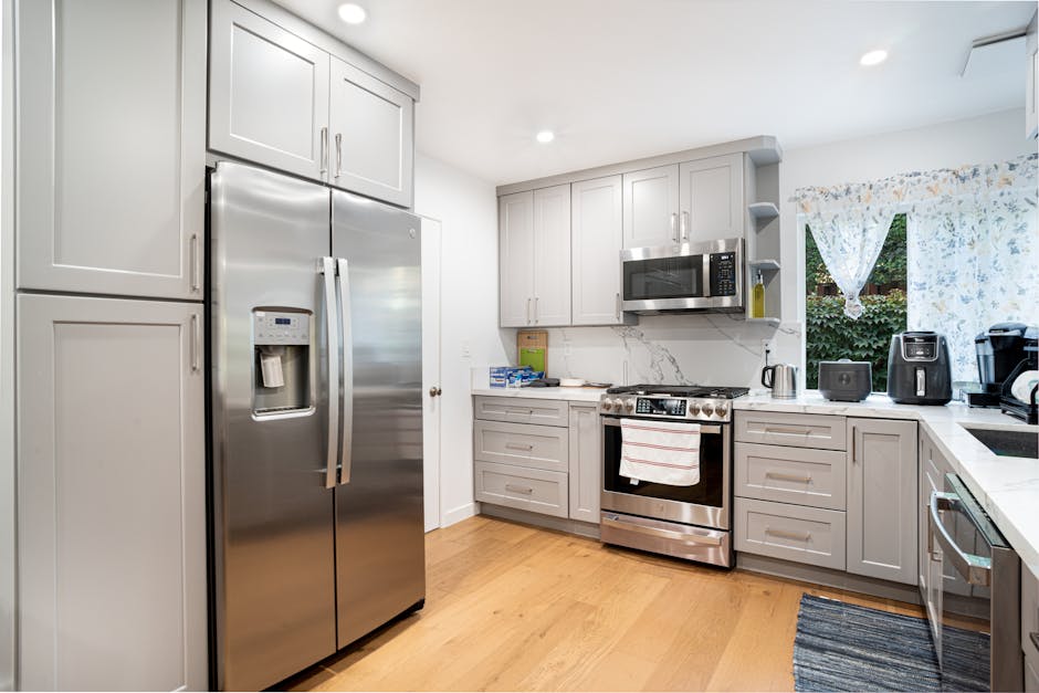
- Alabaster (SW 7008): With an LRV of 82, this is perhaps the most famous Sherwin Williams white. It is a warm white with a subtle beige undertone. Pro: It feels cozy and hides dust better than a stark white. Con: In rooms with heavy northern light, it can occasionally look slightly creamy or yellow.
- Snowbound (SW 7004): This has an LRV of 83. It is a cooler white with a very slight gray/pink undertone. Pro: It pairs beautifully with marble countertops and stainless steel appliances. Con: If you have warm wood floors, Snowbound can sometimes flash a strange violet hue.
- Pure White (SW 7005): This is the “safe” choice with an LRV of 84. It is a neutral white that lacks strong warm or cool undertones. Pro: It is highly predictable and works with almost any hardware finish. Con: Some find it lacks the “character” or depth of more nuanced whites.
- Greek Villa (SW 7551): This white has an LRV of 84 and is slightly warmer than Pure White but cleaner than Alabaster. Pro: It creates a sunny, Mediterranean feel. Con: It can look too yellow if paired with very cool, blue-toned LED lighting.
When coordinating these whites with home decor, consider your textiles. For example, if you have a busy family, a high-quality washable rug from a brand like those found on ShareASale (such as various home decor retailers specializing in pet-friendly textiles) can ground these bright whites and prevent the kitchen from feeling too sterile. A white kitchen relies on texture—think woven baskets, wooden cutting boards, and soft linen window treatments—to feel complete and welcoming rather than cold and industrial.
Why Greige and Warm Neutrals Dominate High-Traffic Family Kitchen Designs
The rise of “greige”—a balance of gray and beige—is not just a trend; it is a practical response to the needs of modern families. Pure grays often feel too cold and highlight pet hair, while traditional beiges can feel dated and heavy. The greige category offers a middle ground that masks minor messes while providing a sophisticated backdrop for high-end finishes. These colors are particularly effective on kitchen islands, which take the most abuse from kicking feet at the bar stools.
| Color Name | SW Number | LRV | Primary Undertone | Best Use Case |
|---|---|---|---|---|
| Agreeable Gray | SW 7029 | 60 | Warm Beige | All-over wall color |
| Repose Gray | SW 7015 | 58 | Cool Blue/Gray | Modern, airy kitchens |
| Accessible Beige | SW 7036 | 58 | Gray/Taupe | Traditional cabinetry |
| Colonnade Gray | SW 7641 | 53 | Warm Stone | Contrast islands |
| Mega Greige | SW 7031 | 37 | Warm Brown/Gray | Lower cabinets |
Agreeable Gray is the undisputed champion of this category. It is light enough to be used on every wall but has enough pigment to provide contrast against white trim. From a researcher’s perspective, its popularity stems from its flexibility; it shifts its appearance based on the time of day. In the morning, it may look like a soft gray; by evening under warm LED lighting, it feels like a cozy beige. Repose Gray is its slightly cooler cousin. If your kitchen has a lot of natural light and you want to avoid any hint of yellow, Repose is the better technical choice. However, be warned that in low-light basements or north-facing kitchens, Repose can occasionally feel a bit “concrete-like.” For a deeper, more grounded feel, Mega Greige is an excellent choice for lower cabinets, as its lower LRV hides the scuffs from shoes and vacuum cleaners effectively.
Exploring Deep Hues for Kitchen Islands and Accent Cabinetry
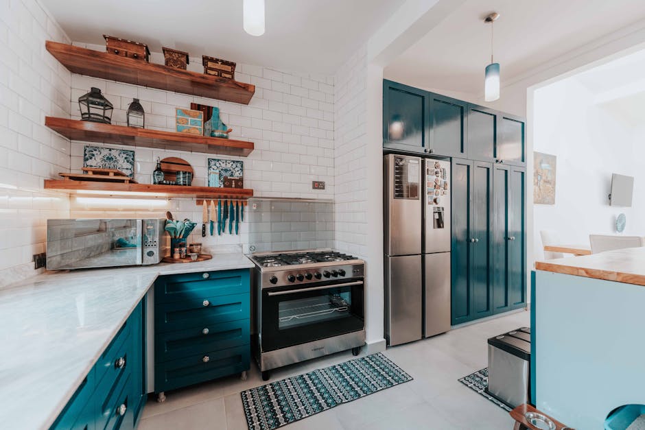
There is a growing movement toward using darker, more saturated colors on lower cabinets and islands. This is a brilliant strategy for families with large dogs or toddlers. A dark navy or a deep charcoal hides scuff marks from shoes and the inevitable splatter from the stove much better than a light color. Sherwin Williams has several “tried and true” darks that have become industry standards for a reason.
Naval (SW 6244) was a former Color of the Year, and its staying power is impressive. It is a true navy that doesn’t lean too teal or too purple. Pro: It looks incredibly expensive when paired with brass hardware (available through various ShareASale home decor partners). Con: Like a dark car, it shows every fingerprint and every bit of flour dust. If you choose Naval, you must use the Emerald Urethane finish mentioned earlier to ensure you can wipe away oils without leaving a smudge.
Another strong contender is Iron Ore (SW 7069). This is a soft black, much warmer than a true jet black. It provides a grounded, architectural feel to a kitchen. For families who want a “moody” look without the kitchen feeling like a cave, Iron Ore on the island paired with Alabaster on the perimeter cabinets creates a high-contrast look that is both timeless and forgiving. If you prefer greens, Pewter Green (SW 6208) is a fantastic earthy choice. It has a gray-green quality that feels organic and pairs beautifully with butcher block countertops or oak flooring. Green is also psychologically calming, which can be a subtle benefit in a chaotic morning kitchen environment. Finally, Urbane Bronze (SW 7048) offers a sophisticated mix of brown and gray that feels rooted in nature, making it a perfect companion for stone backsplashes and copper accents.
The Impact of Natural and Artificial Lighting on Your Kitchen Color Palette
A color is not a fixed entity; it is a reflection of light. One of the most common mistakes homeowners make is choosing a color based on a photo they saw online without accounting for their own kitchen’s orientation. If your kitchen windows face North, you are receiving cool, bluish light all day. This will make cool grays look icy and flat. In North-facing rooms, you need colors with warm undertones—like Creamy (SW 7012) or Agreeable Gray—to counteract that coolness.
Conversely, South-facing kitchens receive warm, intense light. This can make warm colors look overly yellow or orange. In these spaces, you can afford to use cooler tones like Sea Salt (SW 6204) or Rainwashed (SW 6211), which will be balanced out by the warm sunlight. East and West-facing rooms are the trickiest because the light changes drastically throughout the day. A kitchen that looks perfect at breakfast might look gloomy by dinner. This is why I always recommend painting a large sample board (at least 2 feet by 2 feet) and moving it around the kitchen over a 24-hour period.
Artificial lighting also plays a massive role. Most modern kitchens use LED recessed lights. If your bulbs are 2700K (Warm White), they will enhance yellows and reds. If they are 5000K (Daylight), they will enhance blues and grays but can make food look unappealing. The “sweet spot” for kitchen lighting that preserves paint color accuracy is 3000K to 3500K.
Step-by-Step Maintenance for Painted Kitchen Surfaces
Even the highest quality Sherwin Williams paint requires proper maintenance to survive the rigors of a family home. To keep your kitchen looking pristine, follow these technical maintenance guidelines:
- The 30-Day Rule: Do not scrub your new paint for the first 30 days. While the paint may feel dry to the touch within hours, the chemical “curing” process—where the resins knit together to form a hard film—takes a full month.
- Gentle Cleaning Agents: Avoid using abrasive cleaners or pads. A soft microfiber cloth with a mixture of warm water and a few drops of mild dish soap is usually sufficient. For stubborn grease splatters near the stove, a specialized degreaser may be used, but always test it in an inconspicuous area first.
- Immediate Spot Treatment: Acids from tomato sauce, lemon juice, or coffee can etch into the paint film if left too long. Wipe spills immediately to prevent permanent staining, especially on lighter colors like Snowbound or Alabaster.
- Touch-Up Technique: Keep a small airtight jar of your wall and cabinet paint for quick touch-ups. When touching up, use a “dabbing” motion rather than a long brush stroke to blend the new paint with the existing texture.
Common Mistakes to Avoid When Choosing Kitchen Colors
Many homeowners fall into predictable traps during the selection process. One of the most frequent errors is ignoring the flooring. Your floor is the largest plane of color in the room and it reflects its own hue onto the walls. If you have orange-toned oak floors, a cool gray wall will often look blue by comparison. Always hold your paint samples horizontally against the floor to see how the light bounces between them.
Another mistake is overlooking the “Fifth Wall” (the ceiling). In a kitchen, a standard “ceiling white” can often look too stark against nuanced wall colors like Agreeable Gray. For a more professional, cohesive look, consider painting the ceiling in the same hue as the walls but at 50% saturation, or use a softened white like Extra White (SW 7006) to bridge the gap between the walls and the cabinetry.
Finally, failing to account for hardware finishes can ruin a palette. If you are planning on using black hardware, you need a paint color with enough depth to support that high contrast. If you prefer the warmth of gold or brass, ensure your paint has a hint of warmth to coordinate. You can find an array of designer hardware and even stylish bar stools through ShareASale home decor partners that can serve as the “jewelry” for your newly painted space.
Calculating Your Paint Needs: The Technical Side
Before heading to the Sherwin Williams store, you must calculate your needs accurately to ensure color consistency. Paint is mixed in batches, and while modern computer tinting is very accurate, there can be slight variations between gallons. For walls, calculate the square footage (Length x Height) and subtract the areas for windows and doors. One gallon of Emerald Interior typically covers 350-400 square feet per coat.
For cabinets, the calculation is more complex. You must account for the fronts, backs, and the “boxes” of the cabinets. A standard-sized kitchen usually requires 2 gallons of primer and 2-3 gallons of Emerald Urethane Trim Enamel for two full coats. Always buy slightly more than you think you need; it is better to have a quart left over for future repairs than to run out mid-project and risk a slight color mismatch with a new gallon.
Coordinating Your Paint Selection with Family-Friendly Kitchen Decor
The paint color is the stage, but the hardware and decor are the actors. When you’ve selected a Sherwin Williams palette, the next step is ensuring the rest of the room supports those choices. For a family-friendly kitchen, I suggest looking at hardware with a “living finish” or a brushed texture. Polished chrome and polished nickel show every fingerprint and water spot. Brushed brass or oil-rubbed bronze are much more forgiving for sticky fingers. Many high-quality hardware options can be sourced through retailers on the ShareASale network, allowing you to find designer looks that fit a realistic budget.
Don’t forget the impact of your backsplash. If you’ve chosen a busy granite or a patterned tile, your paint color should be a “quiet” neutral like Pure White or Gray Heron. If your countertops and backsplash are simple, you can afford to be more adventurous with your wall color. For families with pets, consider the height of your wainscoting or trim. Using a darker color on the lower third of the wall in a durable semi-gloss finish can create a “splash zone” that protects your walls from pet bowls and muddy paws. This layered approach to color and material selection ensures that your kitchen remains a beautiful space, even when the reality of family life is in full swing.
Ultimately, the best paint color for your kitchen is one that balances your personal style with the technical requirements of your household. By sticking to the premium Sherwin Williams lines and understanding the nuances of LRV and undertones, you can create a space that looks professionally designed but functions like the hardworking family hub it needs to be. Take the time to sample, observe the light, and invest in the right finish—your future self (and your cleaning rag) will thank you.