

The most persistent myth in home decor is that acting on trends requires starting over. It does not. The people who update their homes expensively and regret it within two years are almost always making the same error: they are changing everything instead of changing the right things. The 2026 interior design trends worth paying attention to are not about demolition and replacement. They are about understanding which shifts in colour, texture, and shape reward slower, more deliberate decisions.
Some of what is being called a 2026 trend is already on its way out. Some of it will still look considered in 2030. Knowing the difference is where the real value lies.
The Great Colour Shift: From Cool Grey to Warm Earth
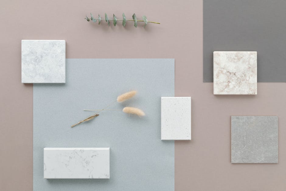
For roughly a decade, grey owned British interiors. Farrow & Ball’s Elephant’s Breath (No. 229) became so ubiquitous it appeared on the walls of everything from new-build show homes to period conversions in Hackney. Dulux’s equivalent cool neutrals shifted millions of litres. That era has closed.
The direction in 2026 is consistently, unmistakably warm. Farrow & Ball’s active collections lean hard into earthy tones — India Yellow, a deep historical amber, is seeing renewed interest in studies and hallways. Setting Plaster (No. 231), a warm dusty blush, has moved from accent wall novelty to full-room choice in bedrooms. Dulux’s own forecasting team, which draws on global purchase data, has pointed repeatedly toward warm terracottas, ambers, and sandy neutrals as the dominant palette.
The table below shows where the market is moving and how durable each direction actually is.
| Colour Direction | Paint Reference | Best Room | Longevity Assessment |
|---|---|---|---|
| Warm terracotta | Dulux Rich Terracotta range | Dining room, bathroom | Strong — rooted in Mediterranean and southern European tradition |
| Warm blush | Farrow & Ball Setting Plaster No. 231 | Bedroom, living room | Medium — elegant but can read dated if overused |
| Deep historical amber | Farrow & Ball India Yellow | Study, hallway | Strong — period precedent supports longevity |
| Warm off-white | Farrow & Ball Joa’s White, Dulux Heritage range | Any room | Very strong — the most versatile warm neutral available |
| Cool blue-grey (declining) | Farrow & Ball Purbeck Stone, Dulux Polished Pebble | Was universal | Fading — visually signals 2014–2026 now |
What to do if your home is already grey
Do not rush to repaint. If the grey has warm or beige undertones — Elephant’s Breath qualifies — it will sit comfortably alongside warm accessories without a full repaint. Add terracotta cushions, amber glass vessels, and warm timber side tables first. See if the underlying grey bothers you before committing paint money. If the grey runs cool or blue, the clash with warm accessories will be obvious within a week, and then repainting makes sense.
The specific warm neutral worth knowing
Mushroom tones are the quietest and most enduring part of this shift. Farrow & Ball’s Joa’s White — an off-white with subtle warmth — and Dulux’s equivalent warm whites sit in a category that photographs beautifully, ages well, and does not date the way statement terracotta can. In bathrooms and bedrooms especially, this is the most dependable choice in the current palette.
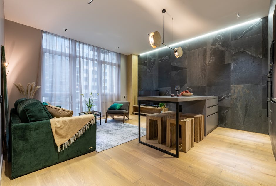
Curved Furniture Has More Staying Power Than Its Critics Predicted
When curved sofas started appearing in every design publication around 2026 and 2026, the dismissals were immediate. Trend piece. Gone by Christmas. It has not gone. By 2026, curved and organic furniture silhouettes have crossed into mainstream retail in a way that signals genuine staying power rather than editorial novelty.
The reasons are not arbitrary. Hard-edged, angular furniture was a direct response to the maximalist excess of earlier decades — clean lines as a corrective. After fifteen years of that correction, interiors are now reintroducing softness through shape rather than through pattern or decoration. This is a coherent design logic, not a whim.
The West Elm Harmony sofa — a deeply curved, low-profile design — has remained consistently strong in sales since its introduction. IKEA’s ÄPPLARYD sectional brought curved silhouettes to around £700, the price point at which a trend becomes genuinely mainstream rather than aspirational. Bolia, the Danish furniture brand, has built substantial sales around curved sofa configurations at the £2,500–£3,500 range — a price bracket where buyers are making considered decisions, not impulse ones. HAY’s About A Chair range introduces gentle organic shaping into dining and desk chairs at around £180–£220 per piece, offering the aesthetic at a lower commitment level.
The design principle underneath curved furniture is simple: one rounded hero piece works. It creates contrast against the rectangular architecture of most rooms. The mistake is stacking curves — rounded sofa, rounded coffee table, curved shelving, arched mirror — until the room feels formless rather than softened.
The pairing that makes curved furniture work
Curved sofas read best against rectilinear context. A curved sectional in front of a rectangular bookshelf wall, under a square-paned window, in front of a flat fireplace surround — the tension between the organic shape and the hard geometry of the room is what creates visual interest. Remove the contrast and the curve just looks accidental.
When to skip curved furniture entirely
Victorian and Georgian rooms with strong period architectural features — cornicing, bay windows, period fireplaces, panelled walls — often resist contemporary curved sofas. The shapes fight each other. In these spaces, a classic Chesterfield, a Lawson sofa, or a tight-back three-seater in a period fabric reads more coherently than any 2026 silhouette. Forcing contemporary curves into a period interior is one of the most common and expensive design errors of the current moment.
Budget entry points worth considering
The IKEA SÖDERHAMN chaise configuration, from around £600, offers a low curved profile that genuinely functions well in smaller living rooms. For dining spaces, the HAY About A Chair AAC 22 in moulded plywood introduces organic shaping without upholstered commitment. These are real products at real prices — not editorial mood board fixtures.
Biophilic Design: What It Is, What It Is Not, and When It Fails
Biophilic design has been discussed long enough that it now has its own failure modes. The honest account of this trend requires addressing those directly.
Does biophilic design mean plants everywhere?
No. Live plants are one expression of it, not the definition. Natural light quality, raw material textures — stone worktops, solid timber furniture, linen curtains, seagrass flooring — views to the outside, and acoustic softness all count as biophilic elements. A room with a single large fiddle-leaf fig, undyed linen Roman blinds, and a travertine lamp base is doing more genuine biophilic design than a room with thirty plastic-potted plants on grey melamine shelving.
Which materials actually qualify as natural in 2026?
The materials with real credibility in current interiors are travertine stone, unlacquered brass, solid oak, rattan, seagrass, and undyed linen. Engineered wood with a printed wood-effect veneer does not qualify. Faux-concrete plaster effect paint sits in a grey area — it creates texture without material authenticity, but used on a single wall it can serve a similar visual purpose. Real polished plaster, applied by a specialist at around £80–£120 per square metre, is one of the signature wall treatments of 2026 and earns its place through genuine tactile depth that no paint finish replicates.
When does biophilic design actually fail?
It fails when it becomes decoration rather than design. A bathroom crammed with trailing plants that die from steam and insufficient light. A “living wall” installed without an irrigation system that turns brown within six months. These are outcomes driven by trend-following rather than considered execution. Real biophilic design starts with the fixed architecture — how much natural light exists, what are the sightlines to the outside, what are the structural materials already present — and builds accessories on that foundation. Not instead of it.
On Textures in 2026: One Verdict, No Hedging
Bouclé fabric is staying. Every prediction of its decline has been wrong. Four consecutive years of sustained commercial demand — John Lewis, Anthropologie, West Elm, independent furniture makers — tells you this is not a short-cycle trend. The combination of warmth, texture, and photogenic quality has kept it in active demand because it solves a real problem: how to add tactile interest to a neutral room without adding visual noise. If you have been postponing a bouclé accent chair because it “feels very 2026”, stop postponing.
The more interesting texture development in 2026 is limewash walls. Farrow & Ball’s Limewash range applies genuine chalky, slightly variable coverage that creates depth flat emulsion cannot match. Their Bone colourway on a single dining room wall, or Shaded White in a bedroom, achieves the kind of aged, layered quality that has historically required professional decorative paint techniques. Annie Sloan’s Chalk Paint, used in a diluted wash, offers a lower-cost route to a comparable effect.
Five Trends to Skip in 2026 and Why
Knowing what to avoid is as useful as knowing what to follow. These five have peaked or are executing badly at scale:
- Uniform gallery walls with identical black frames — peaked around 2019–2026, now reads as a staging choice. Asymmetric arrangements with mixed frame finishes and varied matting are replacing them.
- Fully symmetrical bedroom layouts — matching nightstands, matching lamps, matching everything signals a staged hotel room rather than a home. Deliberate asymmetry — different lamps, one bedside table, one floating shelf — is the current direction.
- Rattan overload — a single rattan element still works: a pendant light, a side table, a chair. Four rattan pieces in one room is a formula, not a design decision. The formula is visible now.
- Two-tone kitchens with a dark floating island — a dark island surrounded by entirely pale cabinetry looks disconnected and dated. Two-tone schemes work better when the dark element runs through the lower cabinetry rather than sitting isolated in the middle of the room.
- Oversized wall clocks as centrepieces — this was a strong moment in 2018–2026. A single large-format artwork or a sculptural mirror reads better in 2026. The clock has become shorthand for “display home” rather than considered decorating.
The pattern across all five: they fail by becoming formulaic. Individually, each element had visual merit when it first appeared. Mass adoption turned them into a checklist rather than a design choice. The moment a trend appears on every property listing, its signal value as a design decision is gone.
How to Apply These Trends Without Renovating
The most cost-effective single change available in 2026 is switching your bulb colour temperature. Most homes run on 4000K–6500K LEDs — cool, slightly blue-white light that actively works against warm interiors. Replacing them with 2700K or 2200K bulbs costs £4–£8 per bulb at any hardware retailer and shifts a room’s entire character from sterile to warm. No paint. No furniture. Just light colour temperature. This change will do more for a cool grey room than any cushion or throw purchased at the same cost.
The three-layer approach to updating any room
Layer one is light — bulb temperature, lamp placement, and maximising natural light through lighter window treatments. Layer two is soft furnishings — cushions, throws, curtains, rugs — all swappable and low-commitment. Layer three is hard furnishings and paint — higher cost, longer commitment, higher visual impact. Most people begin at layer three when they should always start at layer one.
The highest-impact low-cost changes for a bedroom
Warm-tone bulbs at 2700K. Linen or cotton-weave cushions in terracotta or warm blush. A textured throw in bouclé or waffle-weave cotton. A bedside table in warm timber or rattan. Total cost at mid-range retail: around £80–£150. A full bedroom repaint in materials alone runs £200–£400 and takes a weekend. Start with the accessories. If the room still feels wrong after that, then consider paint.
The highest-impact change for a dining room
Lighting. A warm pendant — an IKEA KNIXHULT bamboo pendant at around £25, or a woven seagrass style from The White Company — positioned directly over the dining table changes the room’s character more than any paint colour. Pair it with linen napkins and a terracotta or stone centrepiece and a basic dining room crosses into something considered without replacing a single piece of furniture.
The misconception that opened this piece was that following trends requires wholesale change. What actually works is the opposite: identifying the two or three changes that shift the most perception for the least cost, and making those decisively. That is how you get a home that feels current in 2026 without the financial or logistical cost of treating every trend as a renovation brief.